Card image cap

Table of Contents:


Introduction

Buttons are an essential part of an app. It's hard to imagine an app without a button.
In this blog, we'll see the working of buttons in Flutter.


Methods for onPressed


Create a new Flutter project and in the main.dart add the following methods. We will use these methods later with the buttons.

import 'package:flutter/material.dart';
void main() => runApp(MyApp());
class MyApp extends StatelessWidget {
// This widget is the root of your application.
@override
Widget build(BuildContext context) {
return MaterialApp(
title: 'Flutter Demo',
theme: ThemeData(
primarySwatch: Colors.blue,
),
home: MyHomePage(title: 'Flutter Demo Home Page'),
);
}
}
class MyHomePage extends StatefulWidget {
MyHomePage({Key key, this.title}) : super(key: key);
final String title;
@override
_MyHomePageState createState() => _MyHomePageState();
}
class _MyHomePageState extends State<MyHomePage> {
var text = "Welcome";
void method() {
setState(() {
text = "Hey, Welcome!";
});
}
void method1() {
setState(() {
text = "to";
});
}
void method2() {
setState(() {
text = "Flutter";
});
}
void method3() {
setState(() {
text = "Blog!";
});
}
@override
Widget build(BuildContext context) {
return new Scaffold(
appBar: new AppBar(
title: new Text("Buttons"),
),
);
}
}
view raw methods.dart hosted with ❤ by GitHub


FlatButton


A flat button is a text label displayed on a (zero elevation) Material widget that reacts to touches by filling with color.
Add a new column in the body of the Scaffold of the build Widget in main.dart
In the column add a new Text and a new Row.
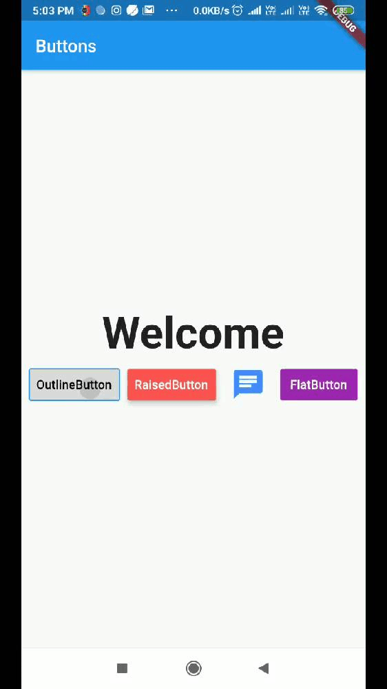
In the row add an new FlatButton as shown.

import 'package:flutter/material.dart';
void main() => runApp(MyApp());
class MyApp extends StatelessWidget {
// This widget is the root of your application.
@override
Widget build(BuildContext context) {
return MaterialApp(
title: 'Flutter Demo',
theme: ThemeData(
primarySwatch: Colors.blue,
),
home: MyHomePage(title: 'Flutter Demo Home Page'),
);
}
}
class MyHomePage extends StatefulWidget {
MyHomePage({Key key, this.title}) : super(key: key);
final String title;
@override
_MyHomePageState createState() => _MyHomePageState();
}
class _MyHomePageState extends State<MyHomePage> {
var text = "Welcome";
void method() {
setState(() {
text = "Hey, Welcome!";
});
}
void method1() {
setState(() {
text = "to";
});
}
void method2() {
setState(() {
text = "Flutter";
});
}
void method3() {
setState(() {
text = "Blog!";
});
}
@override
Widget build(BuildContext context) {
return new Scaffold(
appBar: new AppBar(
title: new Text("Buttons"),
),
body: new Center(
child: new Column(
mainAxisAlignment: MainAxisAlignment.center,
children: <Widget>[
new Text(
'$text',
style: new TextStyle(
fontWeight: FontWeight.bold,
fontSize: 50.0,
),
),
new Row(
mainAxisAlignment: MainAxisAlignment.spaceEvenly,
children: <Widget>[
new FlatButton(
onPressed: method3,
textColor: Colors.white,
color: Colors.purple,
padding: const EdgeInsets.all(8.0),
child: new Text(
"FlatButton",
),
),
],
),
],
),
));
}
}
view raw flatbutton.dart hosted with ❤ by GitHub


onPressed → The callback that is called when the button is tapped
textColor → The color to use for this button's text
color → The button's fill color, displayed by its Material, while it is in its default (unpressed, enabled) state.
padding → The internal padding for the button's child.
child → The button's label.


RaisedButton


A raised button is based on a Material widget whose Material.elevation increases when the button is pressed.
Add the following code in the row to add a RaisedButton.

new RaisedButton(
onPressed: method1,
textColor: Colors.white,
color: Colors.redAccent,
padding: const EdgeInsets.all(8.0),
elevation: 5,
child: new Text(
"RaisedButton",
),
),


elevation → The z-coordinate at which to place this button relative to its parent.


IconButton


An icon button is a picture printed on a Material widget that reacts to touches by filling with color (ink).
Add the following code in the row to add an IconButton.

new IconButton(
padding: const EdgeInsets.all(8.0),
icon:Icon(Icons.chat),
color: Colors.blueAccent,
onPressed: method2,
iconSize: 40,
),
view raw IconButton.dart hosted with ❤ by GitHub
icon → The icon to display inside the button.


OutlineButton


Outline button is similar to a FlatButton with a thin rounded rectangle border.
Add the following code in the row to add an OutlineButton.

new OutlineButton(
onPressed: method,
textColor: Colors.black,
padding: const EdgeInsets.all(8.0),
child: new Text(
"OutlineButton",
),
),


The full code will now look like this.

import 'package:flutter/material.dart';
void main() => runApp(MyApp());
class MyApp extends StatelessWidget {
// This widget is the root of your application.
@override
Widget build(BuildContext context) {
return MaterialApp(
title: 'Flutter Demo',
theme: ThemeData(
primarySwatch: Colors.blue,
),
home: MyHomePage(title: 'Flutter Demo Home Page'),
);
}
}
class MyHomePage extends StatefulWidget {
MyHomePage({Key key, this.title}) : super(key: key);
final String title;
@override
_MyHomePageState createState() => _MyHomePageState();
}
class _MyHomePageState extends State<MyHomePage> {
var text = "Welcome";
void method() {
setState(() {
text = "Hey, Welcome!";
});
}
void method1() {
setState(() {
text = "to";
});
}
void method2() {
setState(() {
text = "Flutter";
});
}
void method3() {
setState(() {
text = "Blog!";
});
}
@override
Widget build(BuildContext context) {
return new Scaffold(
appBar: new AppBar(
title: new Text("Buttons"),
),
body: new Center(
child: new Column(
mainAxisAlignment: MainAxisAlignment.center,
children: <Widget>[
new Text(
'$text',
style: new TextStyle(
fontWeight: FontWeight.bold,
fontSize: 50.0,
),
),
new Row(
mainAxisAlignment: MainAxisAlignment.spaceEvenly,
children: <Widget>[
new OutlineButton(
onPressed: method,
textColor: Colors.black,
padding: const EdgeInsets.all(8.0),
child: new Text(
"OutlineButton",
),
),
new RaisedButton(
onPressed: method1,
textColor: Colors.white,
color: Colors.redAccent,
padding: const EdgeInsets.all(8.0),
elevation: 5,
child: new Text(
"RaisedButton",
),
),
new IconButton(
padding: const EdgeInsets.all(8.0),
icon:Icon(Icons.chat),
color: Colors.blueAccent,
onPressed: method2,
iconSize: 40,
),
new FlatButton(
onPressed: method3,
textColor: Colors.white,
color: Colors.purple,
padding: const EdgeInsets.all(8.0),
child: new Text(
"FlatButton",
),
),
],
),
],
),
));
}
}


The full code is available here


Final Thoughts


Like it? Don't forget to upvote so that we can make more of these tutorials. Let us know in the comments how can we improve.


That's All! <3
Happy Coding!


Authors


Aayush Upadhyay

www.instagram.com/aayush.5/

Google Associate Android Developer


Create an Account


Have an account? Log In

CodingWithMitch Members

Unlimited access to all courses and videos

Step by step guides to build real projects

Video downloads for offline viewing

Members can vote on what kind of content they want to see

Access to a private chat with other communnity members & Mitch

Become a Member

CodingWithMitch Members

Unlimited access to all courses and videos

Step by step guides to build real projects

Video downloads for offline viewing

Members can vote on what kind of content they want to see

Access to a private chat with other communnity members & Mitch

Become a Member

Comments